Character Design
Add comment!December 10th, 2015
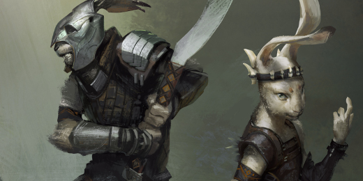
Hey everyone! I’m Steve, the new character concept artist for Overgrowth. In this post I will share some of the designs I’ve been working on. All images in this post can be clicked to bring up a wider view and higher resolution version of the image.
It’s been a bit of a challenge to get used to drawing anthropomorphic animal characters as I have very little experience with animal anatomy. Here is my first attempt at designing the Overgrowth races, completed during the application process to supplement my portfolio:
As you will notice, proportions are totally wonky and cartoonish and my lacking knowledge of animal anatomy is painfully obvious.
My first explorations of the individual races involved pushing the variations as much as possible while staying within the boundaries of established racial characteristics. Unique shape language and distinct silhouettes were the primary concern at this stage. However, my linework approach was taking too much time, so I started working with solid silhouettes and more natural poses.
Sketching silhouettes is a common concept art technique that allows you to quickly create variations of a subject because you only need to think about its overall shape. Furthermore, this approach made it easier to draw the characters in a variety of angles and poses and really helped me understand the forms better. I also took the opportunity to come up with some ideas for gender differentiation. For instance, male rabbits could have hare-like facial features (i.e. more prominent brow ridge, greater distance between eyes and nose, longer snout) whereas female rabbits could look more like rabbits.


Creating unique character designs helped me work out the unique flavour of each race. It’s also nice to take a break from anatomical sketches once in a while as they can get quite tedious to draw. These first two character designs are heavily inspired by the work of Aubrey, who has created such a rich foundation with his art for Overgrowth.
To better differentiate the races, I determined distinct limb and torso proportions for each race.
I then created turnaround sketches based on these proportions, focusing on the differences in muscle mass between the races and genders.
Next, I refined the heads. Referencing photographs, I drew the heads from a variety of angles and in different lighting situations to make sure I understood the forms. I also sketched many of these from imagination to try out different facial characteristics. I felt that it was important to not only focus on accuracy and realism with the heads, but to add expressive potential through slight alterations to the real life shapes. Increasing the size of the chin or brow ridge, for example, goes a long way in making an animal’s face more expressive.


I took what I learned from the face studies and created a set of racial characteristics charts to compile all of my ideas for racial and gender differentiation. This serves to keep my following drawings focused by setting more defined parameters to work within.
Here are the refined musculature sketches where I’ve implemented what I learned from the face studies and incorporated suggested changes from feedback. These designs are now in the process of being modeled to see how they look in 3D and will be further refined as needed.


I then completed fur studies for each race using photo textures and the smudge brush. Here I experimented with variations in texture, fur length, patterns, and color.
Finally, I performed another round of refinements on the designs, mainly fixing proportions but also improving the faces of the rabbits and cats.


The Canadian in me feels compelled to apologize for writing such a long post… So sorry! But thank you for reading, I hope you like the progress so far. Keep an eye out for more character art posts and maybe even some timelapse videos of my art in the future. Cheers!


