Resolution-Independent UI
Add comment!September 20th, 2009
Most UI is designed in terms of pixels, with the assumption that a pixel is a constant unit of measurement. This is troubling because, depending on the user's resolution and quality of their display, a pixel can vary dramatically in size. This is especially a concern in full screen video games, where no matter what the size of your screen is, people love to max out their resolution. I think we've all been in the situation where we have had to squint to read text that becomes tiny at ultra high resolutions.
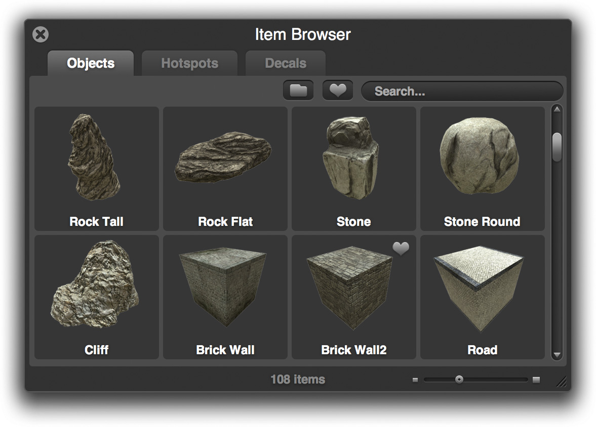
So what is the solution? Here's a rough outline of how we are handling it in Overgrowth. Let's use the item browser UI as an example:

Let's use that as the reference for how the item browser is supposed to look. However, to someone with a high DPI display, or who has cranked up their resolution, they might see something more like the following:

This is pretty tiny and not very usable. The user can resize the window to make it wider and taller, but that won't make it any easier to read -- it will just make yet more objects fit into the viewport. How can we solve this so that you don't need a magnifying glass to read the text?
Well, it seems like the sensible thing to do is make it bigger. If we scale up the UI based on the DPI and resolution, this will at least make the UI the correct size across different displays. Here is the original UI scaled to 2x:

Click image to enlarge
However, this looks terrible! We are merely scaling up a raster image, which introduces tons of artifacts and is almost not even more legible. It's like watching a low-def broadcast on your shiny new HDTV. We can do better.
The text is the biggest problem, so let's tackle that first. Luckily, text is easy to scale up. Most fonts are defined in a vector format, meaning they are defined in terms of geometric primitives. In other words, you can change the font-size all day long and it will always look crisp. Also, there's no reason for the object thumbnails to be blurry. When we (and community member Hale) made the thumbs, they were taken at a very high resolution, so it's easy to make them sharp.
So let's try this again, but this time, we will adjust the fonts so that they are still crisp and use the higher resolution thumbnails:

Click image to enlarge
This looks much better, and is now legible at any size. However, eagle eyed readers will note that something still looks a bit off here. Namely, the jagged and blurry edges of the scrollbars, the close widget, and a number of other elements. Here's all the problem elements together:

These ugly edges have no business in a fine game like Overgrowth
This is easy to solve if you design for it from the beginning. There are two ways we are solving this. Firstly, for some images, we use SVG (scalable vector graphics), which is an open vector format. Like fonts, SVG images can scale to any arbitrary size, so they are invaluable when creating a resolution independent UI.
However, many of our images are created with Photoshop vectors, which, while resolution independent, can't be interpreted by WebKit. Therefore, we rasterize them at both an oversized HD resolution and a regular resolution and down-sample the HD version when necessary.
Here is the result:
Click to enlarge
If there's any interest, I can post a more technical discussion of the CSS involved to accomplish this in WebKit / Awesomium.